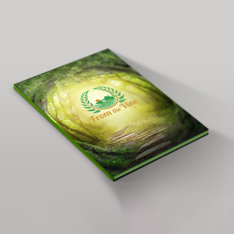
From the Vine’s identity is rooted in the values of peace, order, and health. Every design decision as far as color, layout, and typography, was made to feel refreshing, balanced, and pure. The result is a brand that embodies calm sophistication and a sense of natural clarity.
Altogether, the system conveys a sense of freshness and composure—leaving the viewer with the same calm, restorative feeling that defines the brand itself.
Visual Language:
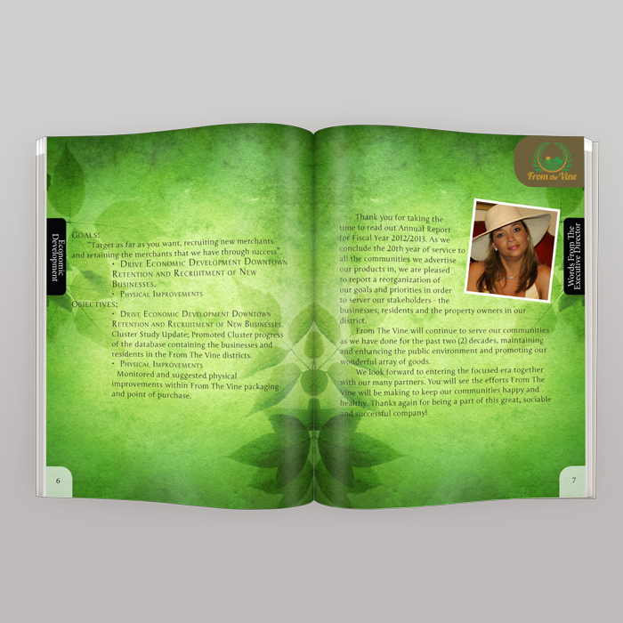
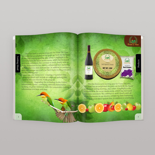
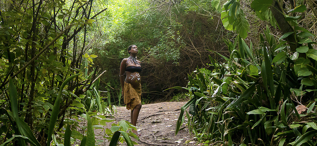
The imagery and textures—seen in the brand’s annual report and marketing materials—immerse the viewer in a forest-like environment, symbolizing growth, freshness, and renewal. The sunlit greens and organic patterns establish an inviting visual rhythm that connects the brand to its agricultural roots while maintaining a refined, contemporary look.